

Rebuilding a brand
This project was probably one of the first that pushed me to design in a more consistent and business savvy approach. GLIDE Lab was the company I had chosen to work for during my time at Drexel University. GLIDE stands for Games and Learning in Interactive Digital Environments, creating serious games focused on teaching children STEM related skills through interaction. When GLIDE first reached out to me, I had no commercial experience designing, and basically no experience handling web design or development outside of classes. Knowing that this space was a place for students to not only create, but also learn, I was hired on as their Web Designer lead after providing my knowledge with CSS, wordPress, and graphic design.


(initial redesign mockups with themes carried over from the original website; the original website design is long gone and this is the closest example of that website)
in the beginning…
The problem with the GLIDE website. I was astonished with the amount of work that needed to be done. Broken links were everywhere, and a mass of images all over the place! Taking on a task like this was incredibly daunting, as I was pretty much working on this all by myself.
Here we have the initial color palettes for the website, and a basic sketch of what I would want the final product to be. Overall, a simple update using the Drexel University Digital Media colors with a much cleaner template and sleeker look than the original site. This would be followed by a few color palette variants of what would eventually lead to the final design.
FRAMING THE CONTENT
Wireframing for this project was probably the most fun I had for this project, being that I could come up with clean and unique mobile designs that fit our company’s Identity. The transition from paper to digital was pretty smooth, using sketch as my design tool of choice before eventually moving to Figma (because Figma is free and I am a very broke post-grad) that summer.


The initial grayboxes were focused mainly on content placement and general presentation. Through consistent correspondence with my client I was able to get an idea of what exactly he was looking for as far what the overall feel and general look of the site. The other portion of this was logistics, meaning what I was actually capable of developing for the site. Next was my favorite part of the design process: mid-fidelity.
A touch of color
A touch of color can make all the difference as far as visual design and presentation. My client was adamant that we focus on a color palette that would be both professional and indicative of his own personal flair, while also maintaining the Drexel identity. Out of the five choices submitted the two final choices came down to a gold and blue design and a monochrome baby blue:


For mid-fidelity, we chose to move forward with the blue and gold design, and made minor changes to the overall layout, while keeping specific artistic assets and font choices.


Moving forward to mid-fidelity showed generally pleased results with the client. By adding little pops of color and utilizing more competent content hierarchy we were able to achieve a professional and inviting feel for the site. Moving forward, all that was needed was to finally start building out and designing the site for High Fidelity, focusing on typography, graphic creation, and developing the proper code structures for building a custom wordPress theme. After doing research into which custom theme builder I should use to develop, I decided to use html5blank over Bones, which I think had lost creator support by that point.
The Final Product
The final product proved to be one of the most challenging projects I’ve ever built, but also proved to be the most rewarding. The company still continues to use the designs in their website even after I left in February of 2019.


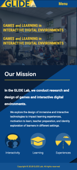

Tons of improvements and graphics created by me and Icon/Graphic Designer Juan DuArte were added, a new logo was designed, and fonts were picked that would fit the page and make the whole site seem more cohesive. As far as development, CSS Grid and Flexbox were used to create dynamic changes between various screen sizes. This project was arduous, but overall the most rewarding portfolio piece that I could have because it proved to myself I have the capability to design for professional clients.